re:Kassa is a free online cash register for small and medium-sized businesses in Kazakhstan: entrepreneurs issue receipts, run shifts and view reports right on their phone or computer. In 2024 the service had more than 700,000 users and about 35% of the country’s online cash register market (Digital Business); at the time it was part of Freedom Holding.
A cash register is used for every purchase: sellers open it with a queue waiting, often with one hand. So every extra step in a sale is felt immediately.
Task
Update the UI/UX of the mobile and desktop apps: simplify key scenarios, make the interface more modern and consistent, and lay the foundation for further product development.
Approach: Jobs to be Done
The redesign started not from screens but from the jobs an entrepreneur opens the cash register for: ring up a sale, open and close a shift, view a report, set up the receipt and printer. This way the interface was shaped around users’ real needs and expectations rather than the product’s internal structure.
How the work went
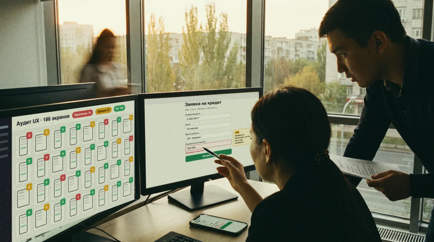
- As Is process. We analysed the current scenarios and identified pain points. Based on them, we designed the To Be process: fewer steps and clearer connections between screens.
- Product and users. Processes and needs of the target segment, the overall product CX and user flows of key scenarios.
- Prototypes, from low-fi to hi-fi. First the logic and sequence of screens, then the details.
- Design system and UI kit. Shared rules and components: screens look consistent, and new features are built faster.
- Final design for the mobile and desktop versions.

What the new interface includes
- First contact: onboarding, sign-in and step-by-step cash register registration.
- Home screen: cash register and shift status, and what needs to be done right now.
- Sale: two scenarios, with all states and hints.
- Shift and X-report.
- Settings: cash registers, receipt, printer, price list, users, profile and third-party apps.
- Business services inside the cash register, such as Freedom Box and Freedom Credit.

All screens are built on one design system: the palette, typography and components are shared across mobile and desktop.

Result
re:Kassa got an updated interface for mobile and desktop and a design system on which new screens are built. It is more than a new look: the core cash register scenarios became shorter and clearer, and the product gained a solid foundation for growth.